The fix is written out below.
Captions available · press CC · Also on YouTube
On a phone, your page slides to the side when you scroll, and there's a blank strip on the right. On a desktop everything looks fine.
Your site isn't broken. One thing on the page is wider than a phone's screen, and the phone lets you slide the whole page sideways to reach it. Find that one thing and the gap goes. Everything below, and in the film above, was done on a real WordPress site with Elementor 4.4.0, where we made the fault on purpose and fixed it again, both ways.
What actually happened
Elementor's help page for this puts it in one line: the horizontal scroll bar is caused by "an element which creates overflow". Something is wider than the screen, so the page becomes as wide as that thing. Everything else on the page still stops at the screen's edge, and the space beside it is the blank strip.
On our test site it was the shop's email address, added to the About page as a big heading at 44 pixels. On a desktop it fits on one line. On a phone 390 pixels wide, it doesn't: an email address has no spaces, so it stays on one line, runs past the edge, and made our page 624 pixels wide.

Step 1: find what's too wide
The editor can show you what's too wide, if you look in the right place.
- Open the page with Elementor.
- Switch to the Mobile view. It's the phone icon in the editor's top bar (its label reads "Mobile Portrait"). The page is shown at phone width.
- Scroll down the whole page and watch the right-hand edge. Anything that runs past it is the cause. Ours was easy to spot: the email address ran straight off the edge of the phone.

Elementor's help page also gives two other ways. One is a short snippet to paste into the browser's console, which outlines elements that stick out in red. We tried it on our page and it did not pick out our heading: the heading's box fitted the screen, and only the words inside it spilled over, so look at the page itself too. The other is to save the page as a template and delete its containers one at a time in a copy, checking on a phone after each, until the strip goes. We didn't need it.
Solution 1: make it fit on phones
This is the better fix, because nothing gets cut off. Elementor's help page also says to adjust the elements you find; for a heading, this is how. Give it a size for phones only, so the desktop keeps what it had.
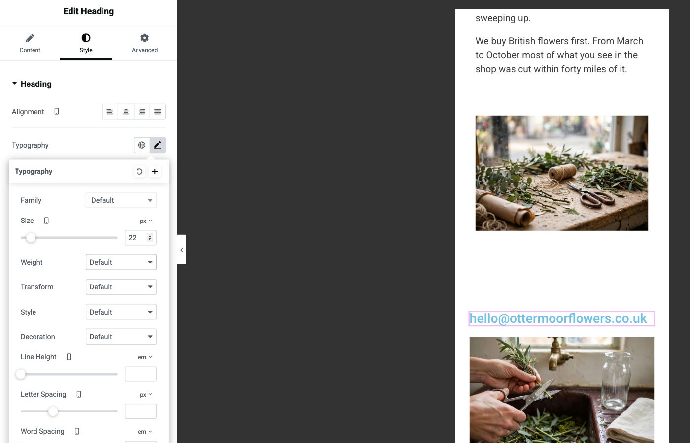
- In the Mobile view, click the element (for us, the heading) and open the Style tab.
- Open Typography and find Size. Beside it is a small phone icon: in the Mobile view, a value set here applies to phones only. Elementor's help pages call these the settings with a device icon.
- Make it smaller until it fits. We typed 22. The address now fit on the phone screen; on a desktop it stayed at 44.
- Click Publish, then open the live page on your phone and try to slide it sideways. Ours stayed put.
For something that isn't text, look for the same phone icon beside its own width or size setting.
Solution 2: hide the overflow
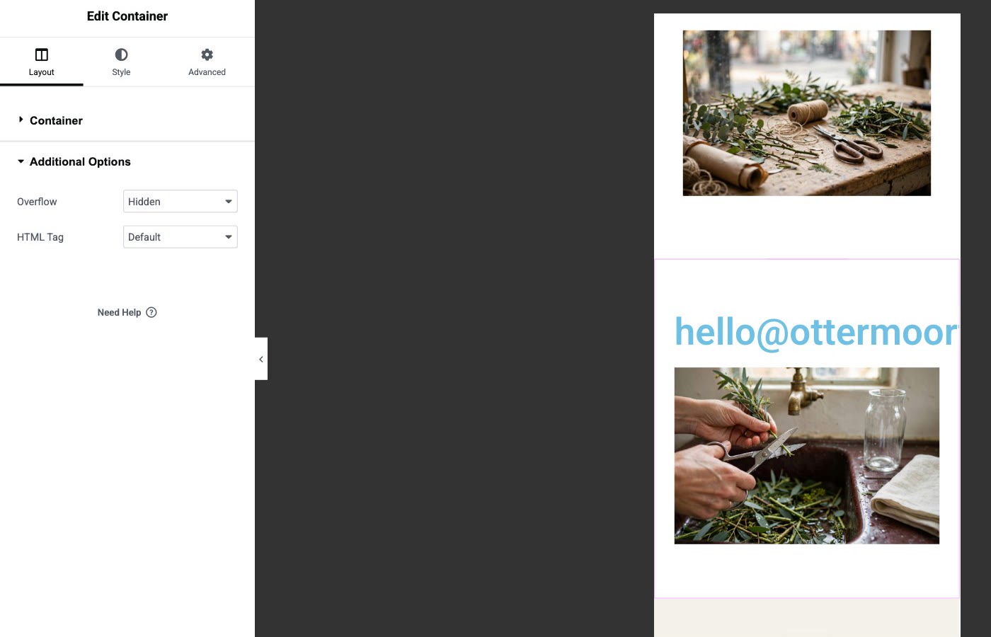
This is the Overflow setting Elementor's help page shows. It's quick, but it only hides what sticks out past the container's edge: the page can no longer slide, and the part that sticks out is simply cut off.
- Select the container the element is in. Hover over that part of the page and click the handle that appears at the top of it. The panel says Edit Container and opens on the Layout tab.
- Open Additional Options and set Overflow to Hidden.
- Click Publish, and check the live page on your phone.
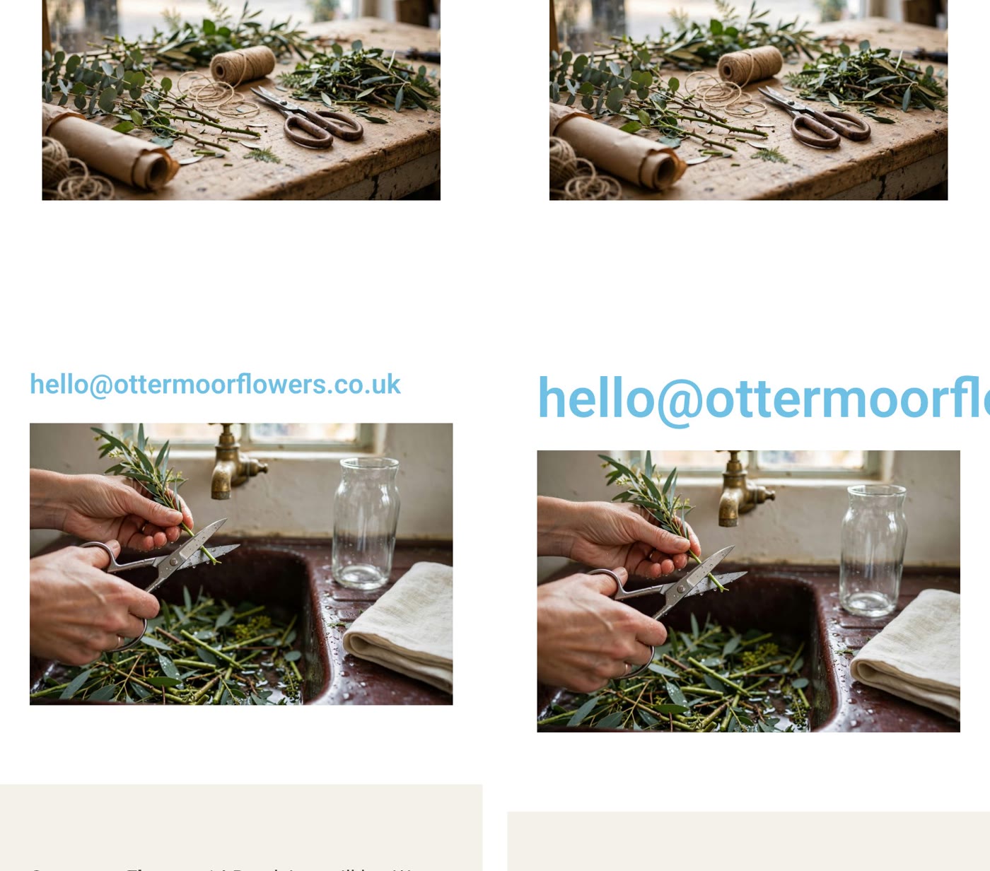
Use solution 2 when the part that's hidden doesn't matter, such as a decoration that runs off the edge, and always look at what got cut. For us it cut the end off the email address, so solution 1 was the right one.
Before you publish your next change
- Look at every page in the Mobile view. Scroll all the way down and watch the right-hand edge.
- Give big headings and long words a size for phones. Email addresses and web addresses don't break onto a second line.
- Open the live page on your own phone and try to slide it sideways. If it moves, step 1 finds why.
- Step 1: open the page with Elementor, switch to the Mobile view, scroll and look for what runs past the right-hand edge.
- Solution 1: select it, Style › Typography › Size (the one with the phone icon), make it smaller until it fits, Publish.
- Solution 2: select its container, Layout › Additional Options › Overflow: Hidden, Publish, and check what got cut off.
Or, there is another way
Everything above fixes the gap on your phone. If your site is a few pages, a contact form and some photos, there is also a different way to keep it.
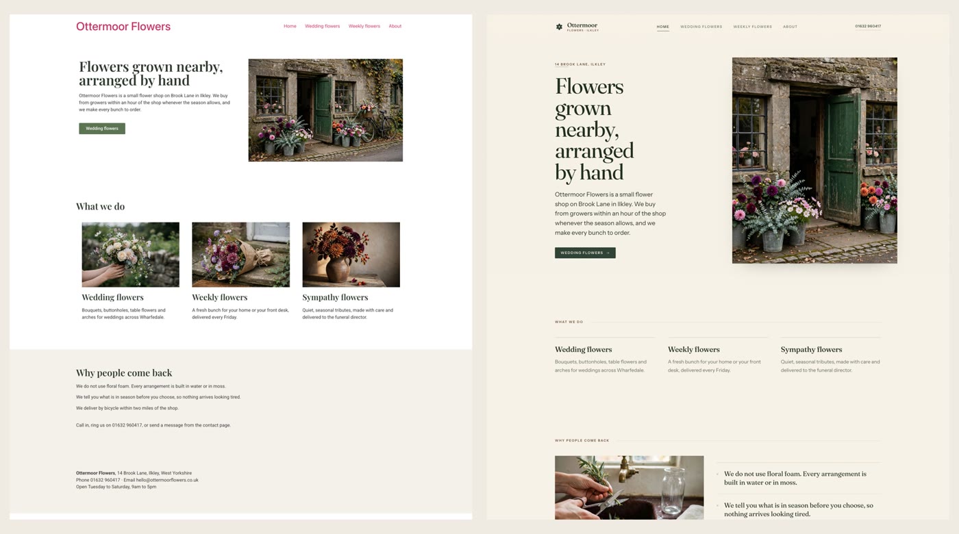
Ullbek is an AI website builder. You hand it your site's words and your own photos, and it builds a new, custom website with a new look, made to fit phones as well as desktops. When we tried it with the Ottermoor Flowers site from this post, we checked every page of the new site at phone width, and every page was exactly as wide as the screen. Every page was kept at the same address, all of the wording was kept word for word, and only the florist's own photos were used. It asked one question, about the colours, and took about a quarter of an hour. When you want something changed, you just say what should be different.
- Put your words and photos together. One text file with each page's wording and its address, and the photos that are yours.
- Say what you want. Ours: "Build a new website for my flower shop, Ottermoor Flowers, with a new look. The words for every page are in the file I've attached, my-website-words.txt, and the photos are my own. Keep every page and all my wording, put each page at the address written in the file, and use only my photos." It asks what it needs to know, and builds.
- Look it over, publish, then move your domain. The move guide walks through every step, including what to collect from your old host first.
A new site, made to fit phones
See how moving a WordPress site to Ullbek works, step by step.