The three solutions are written out below.
Captions available · press CC · Also on YouTube
You open a page in Elementor, switch the editor to the mobile view, and change something that looks wrong on a phone. Then you switch back to desktop, and the desktop has changed too.
Nobody did anything wrong, and nothing is broken. Some things on a page are the same on every device, and some can be set for each device on its own. Everything below, and in the film above, was done on a real WordPress site with Elementor 4.4.0, on a heading made with the Heading widget.
What actually happened
On our site, the About page's heading, About Ottermoor, took two lines on a phone. So, in the mobile view, we shortened it to About us. Back in the desktop view, the desktop heading read About us too.
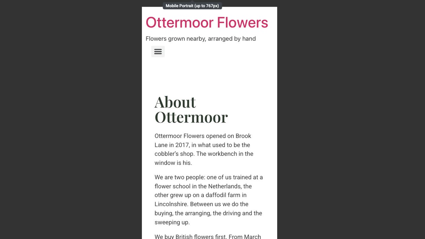
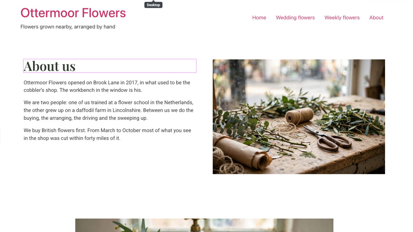
The words in a heading are the same on every device; that is what we saw on our screen. Only some settings can be different on each device. Elementor's help page on responsive editing says that settings which can be customised for different devices "are marked with a device icon". In the mobile view that icon is a small phone beside the setting's name.
Solution 1: Put the words back
- Still in the editor? Open History. It is the clock icon in the editor's top bar. Its Actions tab lists your changes since you opened the page.
- Click Editing Started. The page goes back to how it was when you opened it. On our site the heading read About Ottermoor again, on the desktop and on the phone.
- Already left the editor? Type the old words back in. Any view will do: the words are shared, so they come back on every device. Then publish.
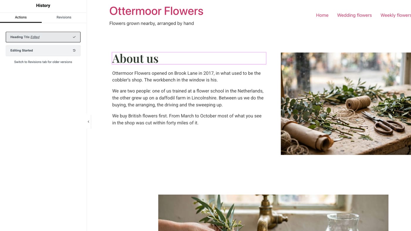
Elementor's help page on history says the Actions tab tracks every action you took "during the current editing session". The same page describes a Revisions tab, which keeps a version each time you save or publish; we didn't need it on our site.
Solution 2: A setting for phones only
Often you don't want different words at all, just a heading that fits. That is a setting, and many settings can be set for phones alone.
- Switch to the mobile view and select the heading. Use the phone button in the editor's top bar, then click the heading on the page.
- Open the Style tab and look for the device icon. On our heading, Alignment has a small phone icon beside it. In the mobile view, a setting with that icon changes only phones.
- Open Typography and change Size. Click the pencil beside Typography. Size has the phone icon too. We set it to 34, and the heading fitted on one line on a phone.
- Switch back to desktop and look, then publish. On ours, the desktop heading was as big as before.
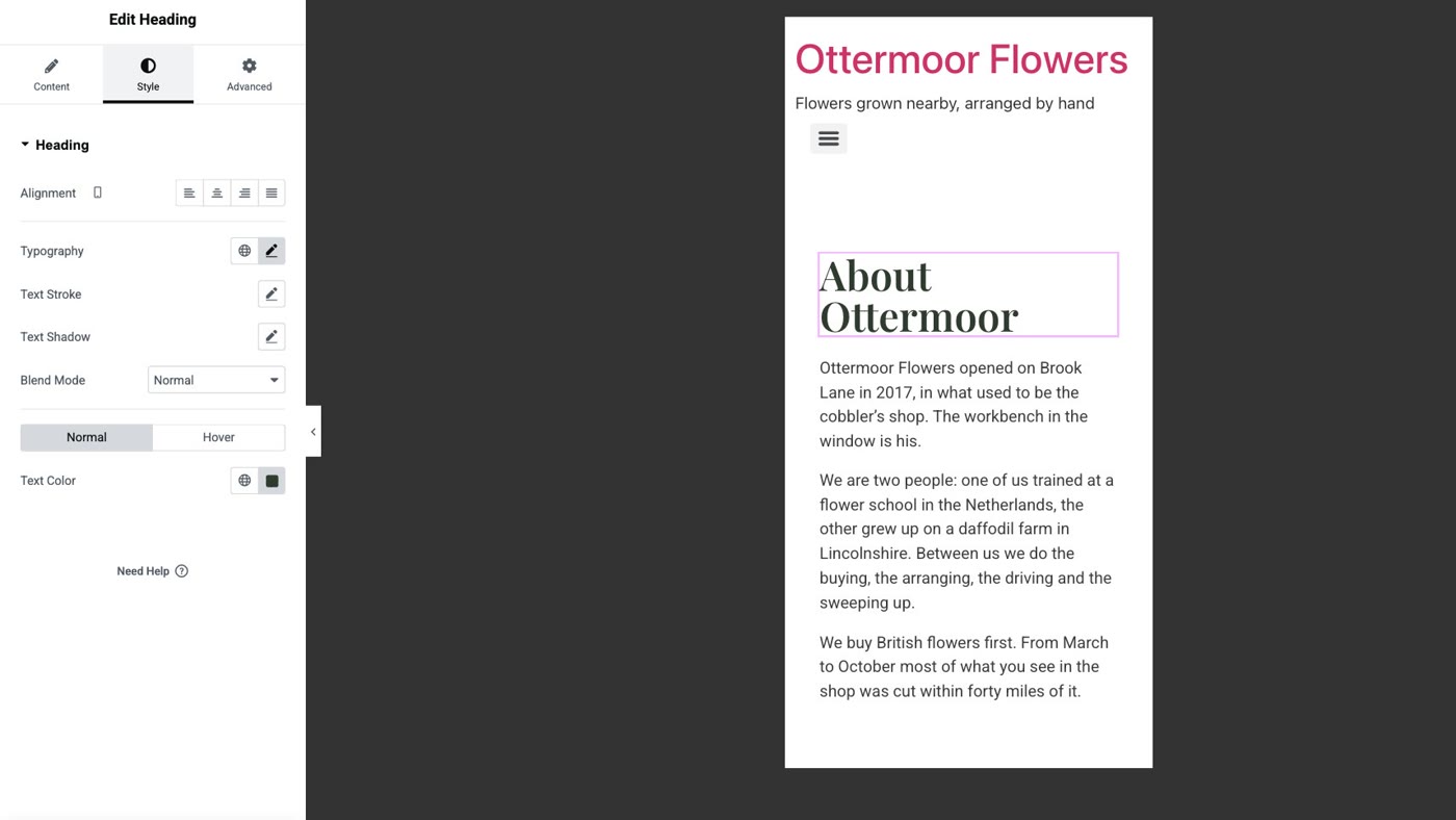
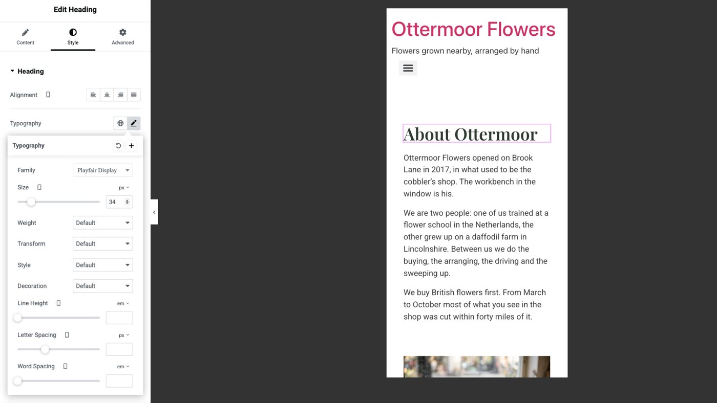
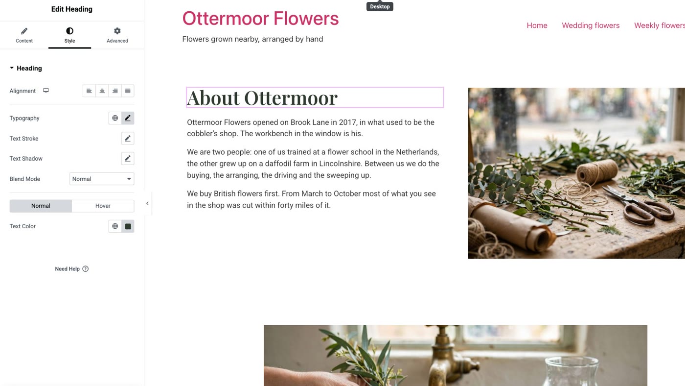
Elementor's help page explains the order: responsive editing is "top-down". A change made for tablets is used on phones too, and a change made only for phones does not affect desktops and tablets.
Solution 3: Different words on phones
When a phone really needs other words, give it a heading of its own, and hide each heading on the devices it isn't for. Elementor's help page on mobile layouts gives the same switch: the element's Advanced tab, Responsive.
- Duplicate the heading. In the mobile view, right-click the heading and choose Duplicate.
- Type the words for phones in the copy. Select the copy and change its title. Ours became About us.
- Hide the copy on bigger screens. With the copy selected, open Advanced › Responsive and switch on Hide On Desktop and Hide On Tablet Portrait.
- Hide the original on phones. Select the original heading and switch on Hide On Mobile Portrait.
- Publish, and look at the live page on a phone. In the editor a hidden heading is greyed out rather than gone, so you can still edit it; the panel itself says hiding takes effect in preview mode or on the live page, not while editing.
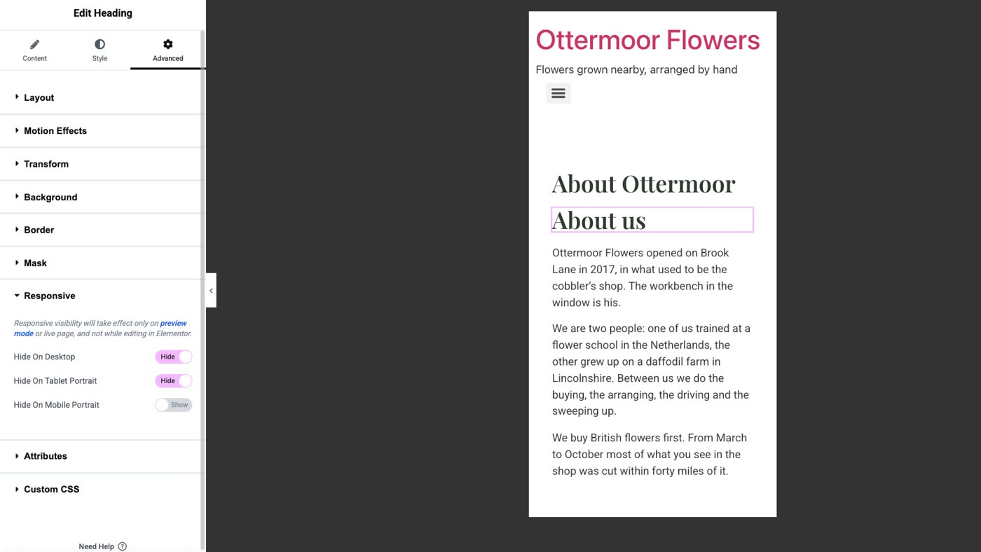
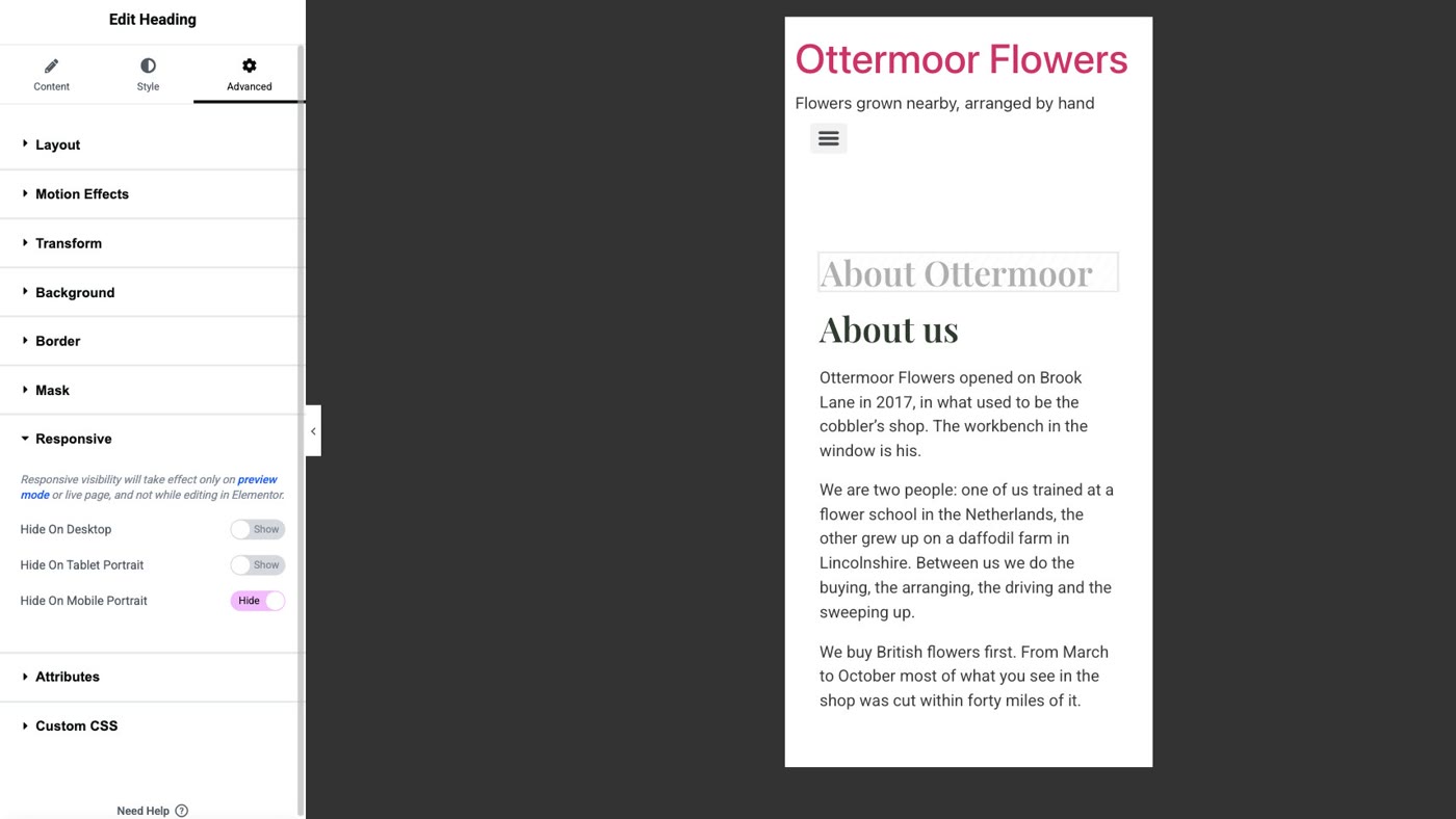
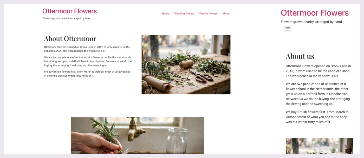
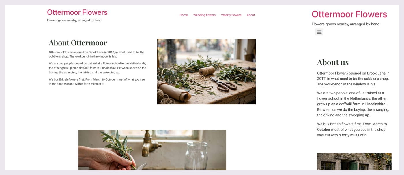
A different picture on phones works the same way: duplicate the image, choose another photo for the copy, hide the copy on desktops and tablets, and hide the original on phones. We tried it on the same page.
Before your next change in the mobile view
- Look beside the setting. No device icon means every device changes.
- A device icon means only the device you are looking at. A tablet change reaches phones too.
- Switch back to desktop and look, before you publish.
- Solution 1: History › Actions › Editing Started, or type the old words back in, in any view.
- Solution 2: in the mobile view, change a setting with the phone icon (Style › Typography › Size, Alignment).
- Solution 3: duplicate the heading or image; on the copy, Advanced › Responsive › Hide On Desktop and Tablet; on the original, Hide On Mobile.
Or, there is another way
Everything above gets your page right on phones and desktops. If your site is a few pages, a contact form and some photos, there is also a different way to keep it.
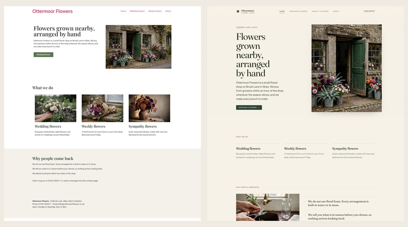
Ullbek is an AI website builder. You hand it your site's words and your own photos, and it builds a new, custom website with a new look, made to fit phones as well as desktops. When we tried it with the Ottermoor Flowers site from this post, every page was kept at the same address, all of the wording was kept word for word, and only the florist's own photos were used. It asked one question, about the colours, and took about a quarter of an hour. And when you want something changed, you just say what should be different.
- Put your words and photos together. One text file with each page's wording and its address, and the photos that are yours.
- Say what you want. Ours: "Build a new website for my flower shop, Ottermoor Flowers, with a new look. The words for every page are in the file I've attached, my-website-words.txt, and the photos are my own. Keep every page and all my wording, put each page at the address written in the file, and use only my photos." It asks what it needs to know, and builds.
- Look it over, publish, then move your domain. The move guide walks through every step, including what to collect from your old host first.
A site made to fit phones and desktops
See how moving a WordPress site to Ullbek works, step by step.